Why “Discount” Doesn’t Have to Mean “Boring”
How Make Studio’s fraenk rebrand turned a budget mobile tariff into a sharp, memorable identity.
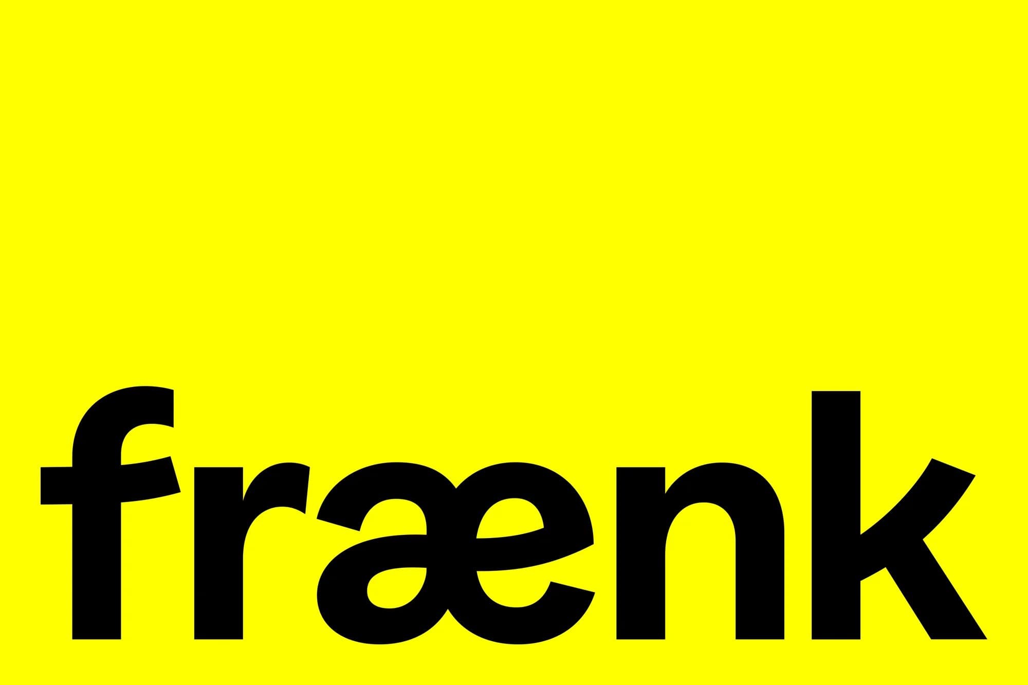
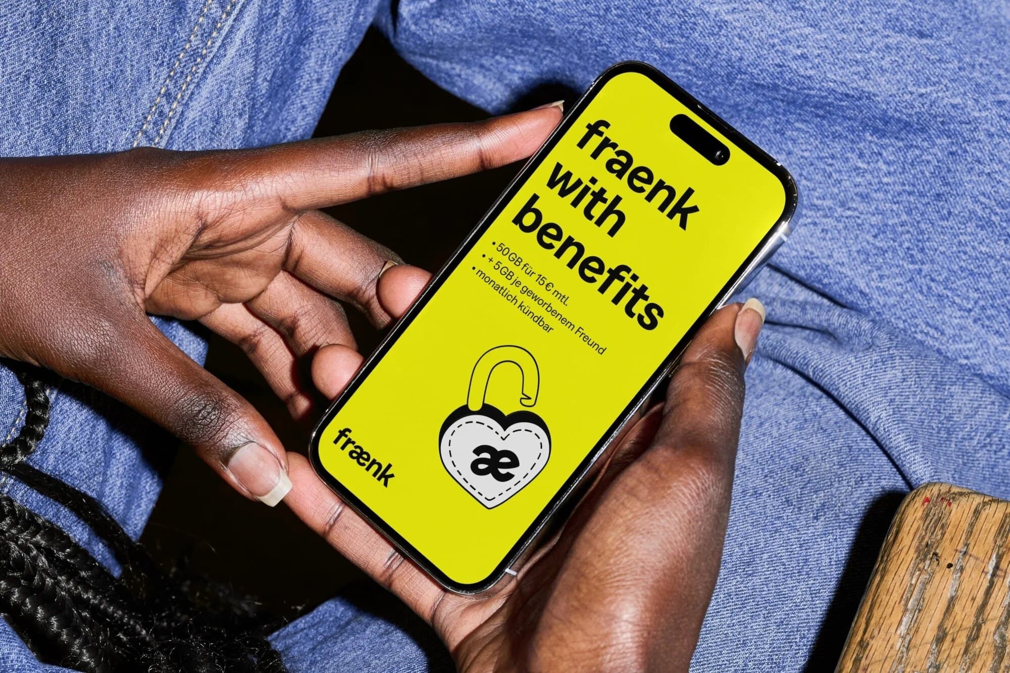
Fraenk is Deutsche Telekom’s app-only mobile tariff, and Make Studio’s rebrand proves that a discount brand can still have personality. Instead of shouting louder on price, which is the usual discount playbook, they took the brand’s old principle of “radically unspectacular” and made it sharper: “spectacularly simple.”
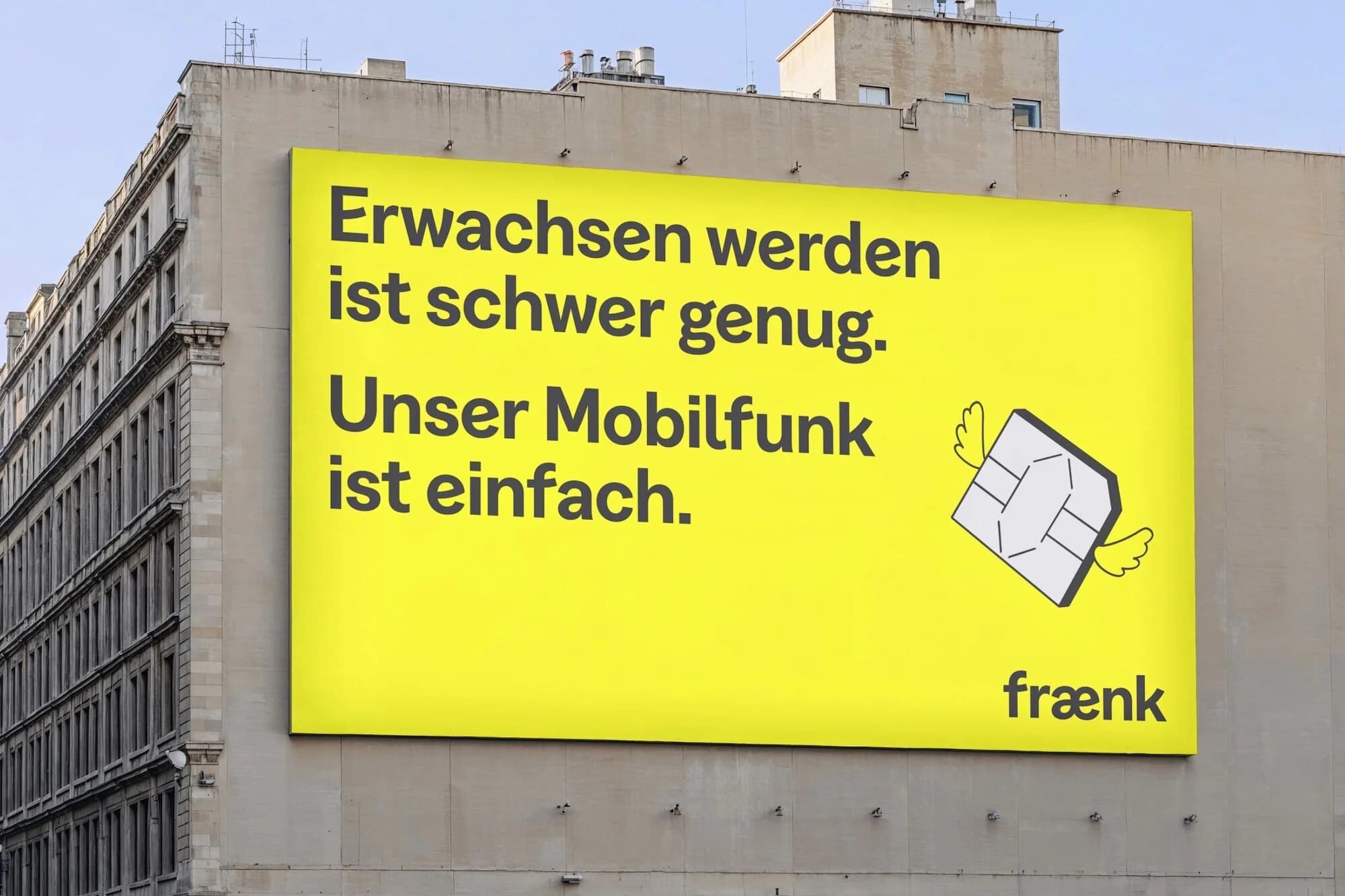
The logo is no longer the hero. Type is. The “æ” ligature was redrawn to feel like two letters giving each other a warm hug, and a custom headline typeface built on Displaay’s Greed carries the personality across every touchpoint. Icons were replaced with a set of playful illustrated doodles.
The result is more than just prettier. Brand perception rose by more than 30% among people who already knew fraenk, and willingness to recommend more than doubled. It is a great reminder that “simple” and “forgettable” are not the same thing.