INNOVEA Labs
Concept
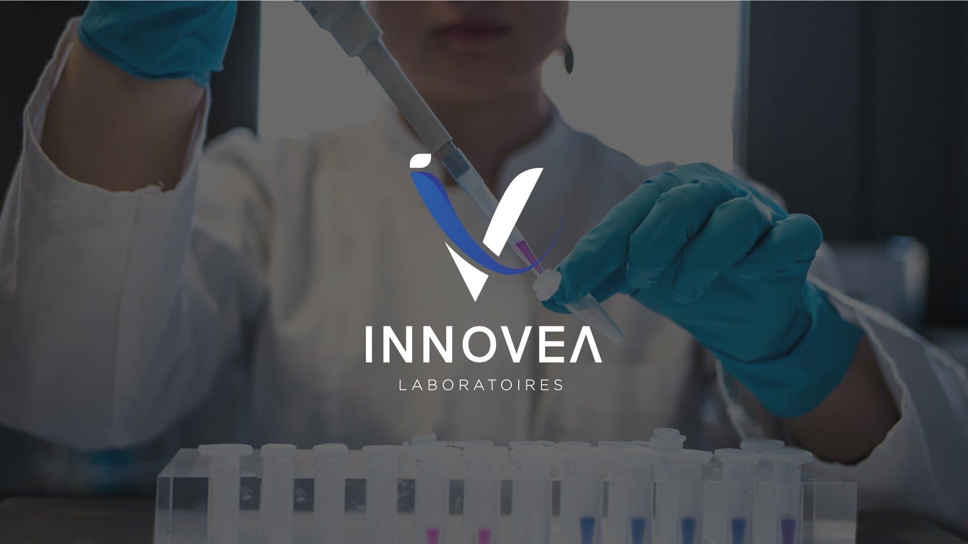
I designed the identity around a refined “V” monogram, rendered as a sharp, faceted mark that reads as both a laboratory instrument and a mark of precision — evoking accuracy, trust, and scientific rigor.
A deep navy and metallic silver-blue palette grounds the brand in credibility and clinical professionalism, while a secondary electric blue adds energy and a more contemporary, tech-forward edge.
The wordmark pairs a clean, confident “INNOVEA” with a lighter tracked “LABORATOIRES” beneath it, keeping the full name legible and formal across all applications. The system was built to move fluidly between corporate, scientific, and event contexts without losing its identity.
Solution
I developed the identity as a comprehensive brand system, starting with the primary and secondary logo lockups, monogram variations, and full color and reversal guidelines to ensure consistency across dark and light backgrounds alike.
From there, I extended the identity into real-world applications: laboratory and office photography treatments, a branded PowerPoint presentation template for internal and client-facing decks, corporate stationery, and large-scale event branding, including exhibition booth graphics, backlit signage, and digital screens for trade shows and conferences.
Typography and color-coding rules were also defined to keep primary and secondary type usage consistent across every touchpoint, from a printed folder to a laboratory backdrop.
Guidelines
The system is documented in a full brand book: logo orientation and construction grid, a wordmark based on Poppins and refined to be more geometric, primary and secondary colour palettes, brand patterns, typography, and rules for incorrect logo use.